
 No WORRY for this fine lady... She Keeps Her Eye on the Ball
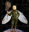
The topic for Illustration Friday was perfect this week as I finished this Digital Collage on Thursday. Oh, by the way, we ate this fish that my husband caught, it was so delicious. Another "by the way"...my husband just shook his head when he saw this illustration, I'm sure he does not get it, but it makes perfect sense to me!
The ball is a selection of the fish eye - I was amazed at the great variation in it when it was enlarged and I applied a blending mode, plus bevel and emboss. The border is a photo of rust on a solid background with a blending mode applied, I love the texture.
 I created 3 variations of this, if you would be so kind as to leave me a comment with your favorite of the three I would really appreciate it. You can also see the images used to create this piece below.
 Here are the images used to create this piece:
Cinnamon colored solid layer
Tan colored solid layer
Scan from old store ledger
Photo of rusty metal, cropped for frame
Sky with clouds image
Calligraphy Image
Image of Domenico Ghirlandaio 1488 painting
Fish my husband caught (yum), with selected fish eye

Thanks for stopping by!
7 comments:
Hi Rebecca, yet another outstanding piece of work! I LOVE this one. My fave is version 1 -- I have been looking at all three images to try and decipher why this one is my top choice. I think it's because I love the golden-green glow on her face.
Debbie
Nice Illustrations. They are all cool!
Lots of depth and interest in this illustration! I laughed a little because of the visual pun ('fish head'). Don't know if it was intentional or not. Anyway, great use of colors. Nice!
beware of cats! (the colors are beautiful, so intense!)
Rebecca, this is fantastic. Nice of you to take the time to share your source material and to see how it all comes together. My preference is #1. The blue is intense, but it still allows a transparency that reveals the background. I also like the contrast with the face coming through in the fish's body. Very fine work.
Thanks for your visit and comments:)
That painting is pretty hard to resist in a collage, isn't it?
Glad to have found your blog.
see you, g
I think I like the middle one, very subtle.
Post a Comment