Sunday, March 16, 2008
Saturday, March 15, 2008
Illustration Friday -Heavy

Heavy or Not -- Anything is Possible
What a great Illustration Friday theme...many concepts came to mind; like Heavy Metal, He Ain't Heavy - He's My Brother (love that one especially), and Heavy Heart. But my very creative daughter came up with a feather lifting an anvil, so I played off the idea with creatures of the same distinction. I love Elephants and found this great one and his feathered friend on istock.
What a great Illustration Friday theme...many concepts came to mind; like Heavy Metal, He Ain't Heavy - He's My Brother (love that one especially), and Heavy Heart. But my very creative daughter came up with a feather lifting an anvil, so I played off the idea with creatures of the same distinction. I love Elephants and found this great one and his feathered friend on istock.
The Design Elements:
I used 3 backgrounds; the textured brown, the diagram and a blue fill layer (it's very light in this example, see it at the top & to the right.) Then I experimented with layer blend modes and transparency. The white lilacs (photo) was placed between the layers to try different possibilities, but I finally decided to plop them in behind the light blue fill layer. Florals always play an important part in my art and life...
Of course the main elements for the collage are the elephant, the dove, and the ribbon which I drew out on my wacom. You can see where I used a layer mask to weave the ribbon in and around my little elephant.
The final layer was created to frame the piece in a very subtle way -- adjusting transparency and using the selection tool, I made a filmy frame to give the piece some depth...oh, and I used a drop shadow on the main elements too.
Now to go create some more in between REAL LIFE...
Labels:
Collage,
digital art,
Illustration Friday,
istock,
Layers,
Photoshop,
wacom
Tuesday, March 11, 2008
Illustration Friday - Spring Garden Fairy

Putting it all together...
Creating the Garden theme image was especially fun for me as I love anything having to do with the Garden, except weeding of course...
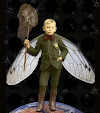
Here are the images I used in this piece. Using blending modes, layer styles, a render light effect, and plenty of layers, I tried to create a collage with depth and an ethereal feel.
It's very satisfying to see the effect and yet, I know I could take these same elements, change a couple of things and create something almost entirely different. That's what I like about a program like Photoshop -- the endless possibilities!

Monday, March 3, 2008
Run, don't walk...
Somerset Digital Studio & Artful Blogging
If you want some really good advice today, here it is...
Run...don't walk...to your nearest fabric, craft or book store & get these awesome Somerset Studio publications before they are gone...gone...gone!
Hey, you will thank me for this.
Labels:
artful,
blogging,
digital,
magazine,
publication,
Somerset Studio,
studio
Sunday, March 2, 2008
Playing around...
Just a little mind game to impress myself...
It looks pretty genuine, don't you think?
Here's the image I inserted on museumr to get this picture.
Hey, I'm having WAY too much fun!
This piece was one of my first large prints.
I loved colorizing the old cabinet card and putting it all together.
It won a Merit Award at the Student Art & Design Show
Coyote Gallery @ Butte College

Labels:
Cabinet Card,
Colorize,
Coyote Gallery,
Layers,
Museumr,
Photoshop
Putting it all together -- the elements
Created in Photoshop using layers, blend modes, render filter for light effects and custom brushes for the edge effect.
 Gathering the elements...
this is quite simple with very few elements, but the filters and blending effects dramatize the results.
Subscribe to:
Comments (Atom)


